Food hazards from around the world Data Competition

We are excited to announce the winner of the 2020 Food hazards from around the world data competition is Robert Eyre with his visualisation project ‘FSA related alert tracker’. 

The Jean Golding Institute recently teamed up with the Food Standards Agency (FSA) for a data visualisation competition 

The competition

Every day the Food Standards Agency receives alerts from around the world about food products that have been found to be hazardous to human health, from salmonella in chicken to undeclared peanuts to plastic in pickles. Sometimes these products make it to our shelves in the UK and have to be recalled or withdrawn. But with so much data on food hazards at our fingertips, we want to be proactive in identifying potential hazards to UK consumers, before anyone buys a hazardous product.  

The FSA made a dataset of food alerts available and we asked for data visualisations that could help to understand how the dataset might alert us to food risks.

The winning project

The winner was Robert Eyre, PhD student, Department of Engineering Mathematics with his visualisation FSA related alert tracker.

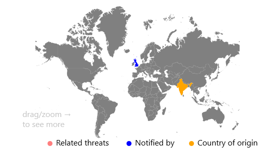
The visualisation is a dashboard that allows the FSA to identify threats that are related. Once an article about a threat has been chosen, you can see where on the map, and where in time related threats happened.

The idea behind the visualisation is to show the threats that had been reported in the United Kingdom, and that given a threat, it should show the other threats related to it. Once a threat has been selected from the left panel, the right panel will automatically update, showing the data source, a link to the data source and information about the incident, such as when the article was published, and what the incident is about. Then, the map will highlight the source of the threat, and the country that reported the threat.

To then show the related threats, there are a series of buttons under the left panel to decide what is classed as a related event. Once one of these buttons are selected, the map is updated to show the locations of the related threats (and roughly how many threats there are by the size of the new circles). This should show the FSA where specific threats are most common when related to the United Kingdom. Additionally, a time series is shown for the related events highlighted. Here the FSA could identify any peaks or dips, that they could then investigate further for events that may have happened.


Image from Visualisation


The winner received £1000 in prize money

The runners up

Two runners-up each receiving £250 are Marina Vabistsevits & Oliver Lloyd and Angharad Stell.

Marina and Oliver received runner up for their visualisation, ‘Too much tooty in the fruity: Keeping food safe in a post-Brexit BritainA brief exploration of the UK’s reliance on the EU for food safety, and the related challenges that Brexit may bring.  

Angharad received runner up for the visualisation From a data space to knowledge discovery An interactive plotting app that allows exploration and visualisation of the dataset. 

The Jean Golding Institute data competitions 

We run a number of competitions throughout the year – to find out more take a look at Data competitions. 

Storing your data in a spreadsheet


Photo via Unsplash by Glenn Carstens-Peters

Blog written by Jonty Rougier, Lisa Müller, Soraya Safazadeh, Centre for Thriving Places (the new name for Happy City)

What makes a good spreadsheet layout?

We were recently trying to extract some data from the All tab of the ONS spreadsheet Work Geography Table 7.12 Gender pay gap 2018

This gave us the opportunity to reflect on what makes a good spreadsheet layout, if you want to make your data easily available to others. The key thing to remember is that the data will be extracted by software using simple and standardised rules, either from the spreadsheet itself, or from a CSV file saved from the spreadsheet. Unless you recognise this, much of your well-intentioned structure and ‘cool stuff’ will actively impede extraction. Here are some tips for a good spreadsheet:

Names

Each of your data columns is a ‘variable’, and starts with a name, giving a row of variable names in your spreadsheet. Don’t use long names, especially phrases, because someone is going to have to type these later. Try to use a simple descriptor, avoiding spaces or commas; if you need a space or some other punctuation, use an underscore instead (see below). You can put detailed information about the variable in a separate tab. This detailed information might include a definition, units, and allowable values.

In our example spreadsheet we have

Current column name Our description Better column name
Description Region names Region_name
Code Region identifiers Region_ID
Gender pay gap median Numerical values GPG_median
Gender pay gap mean Numerical values GPG_mean

There is a mild convention in Statistics to use a capital letter to start a variable name, and then small letters for the levels, if they are not numerical. For example, the variable ‘Sex’ might have levels ‘male’, ‘female’, ‘pref_not’, and ‘NA’, where ‘pref_not’ is ‘prefer not to say’, and NA is ‘not available’.

  1. Use an IDENTICAL name for the same variable if it appears in two or more tabs. It’s amazing how often this is violated: identical means identical, so ‘Region_Name’, ‘region_Name’, and ‘region_name’ are NOT the same as ‘Region_name’.
  2. There are two different conventions for compound variable names, like ‘Region name’. One is to replace spaces with underscores, to give ‘Region_name’. The other is to remove spaces and use capitals at the start of each word, to give ‘RegionName’, known as camel case. Both are fine, but it is better not to mix them: this can cause some old-skool programmers to become enraged.

Settle on a small set of consistently-used codes for common levels

NA for ‘not available’ is very common; in a spreadsheet, you can expect a blank cell to be read as NA. ‘Prefer not to say’ comes up regularly, so settle on something specific, like ‘pref_not’, to be used for all variables. The same is true for ‘not sure’ (eg ‘not_sure’).

At all costs, avoid coding an exception as an illegal or unlikely value, like 9, 99, 999, 0, -1, -99, -999; we have seen all of these, and others besides (from the same client!). If you want to use more exceptions than just NA in a variable with numerical values, then use NA for all exceptions in the values column, and add a second column with labels for the exceptions.

In our example spreadsheet, if you look hard enough you will see some ‘x’ in the numerical values columns. We initially guessed these mean ‘NA’, but in fact they do not! In the key, ‘x = Estimates are considered unreliable for practical purposes or are unavailable’. But surely ‘unreliable’ and ‘unavailable’ are two different things? Ideally only the second of these would be NA in the GPG_median numerical column. A new GPG_median_exception column would be mostly blank, except for ‘unreliable’ where required to qualify a numerical value.

Generally, we prefer a single column of exceptions, possibly with several levels. In another application the exception codes included ‘unreliable’, ‘digitised’, ‘estimate’, and ‘interpolated’.

Put all meta-data ABOVE the rows which store the data

This is because extraction software will have a ‘skip = n’ argument, to skip the first n rows. So everything which is not data should go up here, to be skipped.

  1. DO NOT use the columns to the right of your data: the extraction software will not understand, and try to extract them as additional columns.
  2. DO NOT use the columns underneath your data, for the same reason. Your variables will be contaminated, usually with character values which stop the columns being interpreted by the extraction software as numerical values.

In our example spreadsheet, there is a ‘Key to Quality’ to the right of the columns. Clearly the author of this spreadsheet was trying to be helpful, but this information is already in the Notes tab, and the result is distinctly unhelpful.

In our example spreadsheet we also have three rows of footnotes immediately underneath the data. The correct place for these is in the Notes tab, or above the data.

Do not embed information in the formatting of the cells

This is an unusual one, but our example spreadsheet has done exactly that. Instead of an additional column Quality, the author has decided to give each numerical value cell one of four colours, from white (good quality) to deep red (either unreliable or unavailable). This is useful information but it is totally inaccessible: cell format like colour is not read by extraction software.

Don’t have any blank rows between the row of variable names and the last row of data

This is not crucial because extraction software can be instructed to skip blank rows, but it is better to be safe.

Our example spreadsheet has no blank rows – result!

More information

For more information about Centre for Thriving Places check out their website