A blog post by Angharad Stell, PhD student, Atmospheric Chemistry Research Group, School of Chemistry, University of Bristol
Mental health at university has been making headlines for all the wrong reasons. Every day seems to bring a new shocking article:
- “one in four students suffer from mental health problems” [1]
- “student suicide increase warning” [2]
- “mental health: a university crisis” [3]
Whilst there are plenty of scary numbers out there, there is little knowledge of the cause. Perhaps if we can understand that, we can combat the issue more effectively. Here, data science is used to investigate whether moving away from family to a new environment has an impact on students’ loneliness.
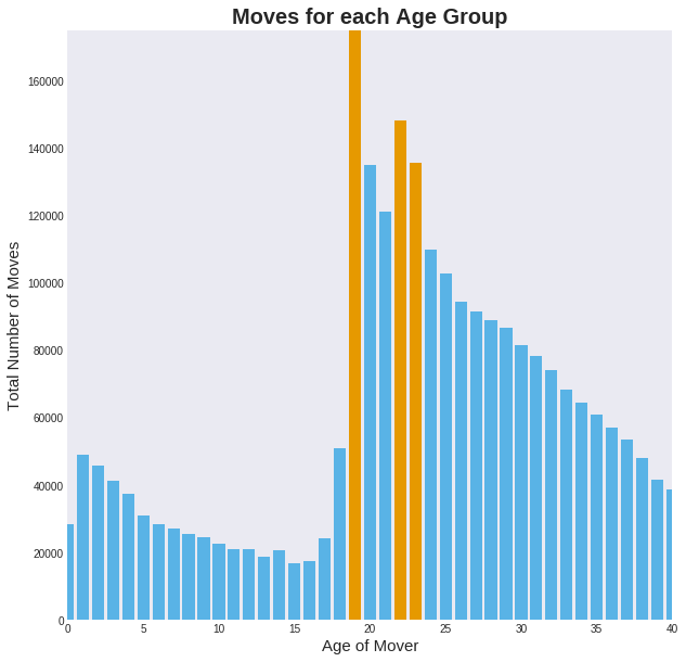
University is often a young adult’s first move away from their family and the area they grew up in. This movement is visible in the UK’s internal migration data shown opposite, with peaks above the underlying trend for when students arrive and leave university.
Different universities will encourage different amounts of movement: a better or more specialised university will attract students from further away. So, if we can compare different universities’ mental health conditions prescriptions, (depression and social anxiety), by selecting the nearest GP, we should be able to see differences related to student movement.
However, there will be many other factors that might affect loneliness at different universities, which we will have to try to take account of:
- Number of students – could large institutes and the associated anonymity be a cause of loneliness? Or could small institutes mean there is less chance to meet friends? It will also be harder to pick up smaller institutes in the data.
- Proportion of UK students compared to international – coming from abroad is the biggest move you can make, does this impact loneliness?
- University Ranking – are higher ranking institutes pressure cookers for young people? Here, the entry requirements, graduate prospects, and student satisfaction are used. Research quality has been cut out as we are only looking for undergraduates, the other three criteria were not combined here, as they measure quite different things.
- Widening Participation – do students from less typical backgrounds find the transition harder? Here, the number of students that come from a state school, low participation area, or receive Disabled Student’s Allowance (DSA) compared to what it would be in a socially equal admissions scenario, are combined together to form one indicator.
 As the GP data is chosen by matching each university to its nearest GP, other factors will affect the data, which will show varying amounts of students and the general population. For example, the University of Exeter’s nearest GP specialises in caring for the homeless, and the University of Salford’s cares for those in nursing homes. Therefore, an attempt is made to consider these external factors:
- Deprivation of the area – do worse off areas have poorer mental health?
- Median age – more young people are lonely [4], and suffer from mental health conditions [5]
The Sutton Trust has a dataset containing how far students have moved, or commute from the family home, to go to university. There are three distance groups: short (0-57 miles from home to university), medium (57-152 miles), and long (more than 152 miles). The complete dataset examined is a combination of this, the university characteristics, and its nearest GP mental health conditions prescriptions and characteristics. Once all the data is collected, the fun bit can begin: data analysis!
Visualising the Data
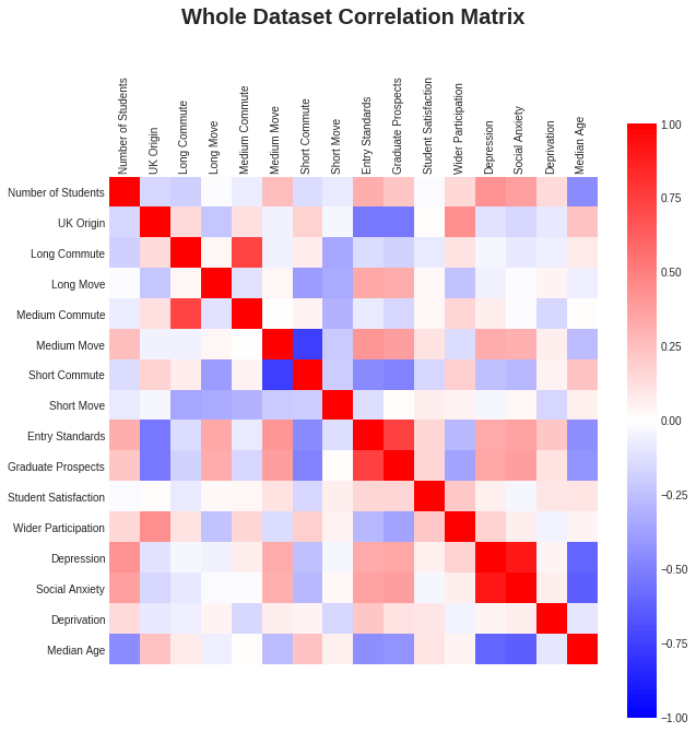 First, let’s examine the correlation matrix, shown on the right. Strong correlations are shown in red, strong anti-correlations are blue, and weak correlations are shown in the paler shades. There are some obvious relations: a better ranked university has more international students, and more movers. There is also a nod to the social inequality of higher ranked institutions taking fewer non-typical background students. Interestingly, student satisfaction is a poor indicator of everything!
Higher rates of mental health conditions appear to be related to:
- Higher number of students at a university
- Higher number of medium movers (lower numbers of short commuters)
- Higher university ranking (entry standards and graduate prospects)
- Lower median age
1 and 4 likely just show that young people have higher rates of mental health issues, however 2 and 3 could be interesting. However, the relations are unlikely to be nice and simple linear ones, and so just looking at this correlation matrix is not enough, let’s try a better way to visualise the data.
Dimension Reduction
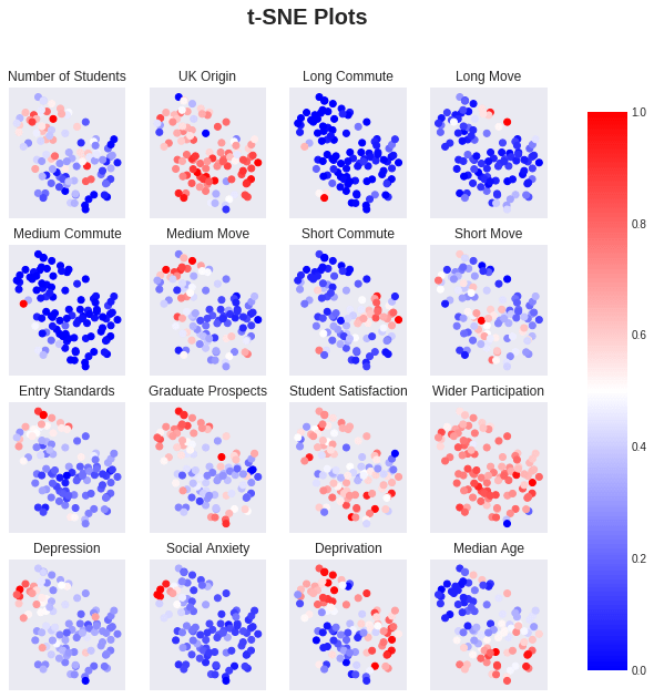
Humans are not good at dealing with graphs in more than two dimensions, let alone the 16 in this dataset. So, let’s reduce the dimensionality, using a dimension reducing algorithm, (t-SNE). This algorithm attempts to plot points that are similar close to each other, and points that are dissimilar far apart. The result can be seen in the figure below, where each subplot is coloured by the values of the title variable, (zero indicates the lowest value of the variable, and one is the highest). From the distribution of the points, you can see there appear to two clusters: one smaller top left and a larger bottom one. From the colourings, there does also seem to be structure in the bottom cluster, so perhaps this can be further divided.
Clustering
Clustering can be very fickle, this is especially true for real datasets with noise, outliers, and not nice circular clumps. So, here four clustering algorithms have been put through their paces, and the best one for our needs selected: K-means, (though agglomerative hierarchical clustering gives a very similar answer and leads to the same inferences).
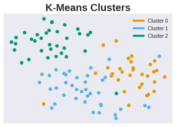 We can look at how the algorithm clustered the points on the reduced dimension projection in the plot on the right. We have here a top, bottom left and bottom right cluster, which seems to mainly conform to the structure that the dimension reduction algorithm suggested.
Now, let’s see what we can learn from these clusters. In the plot below, each cluster’s density is shown by the filled areas, over the 16 variables. The black lines show each cluster’s median value. On the x-axis, zero is the variable’s lowest value in the dataset, and one is the highest.
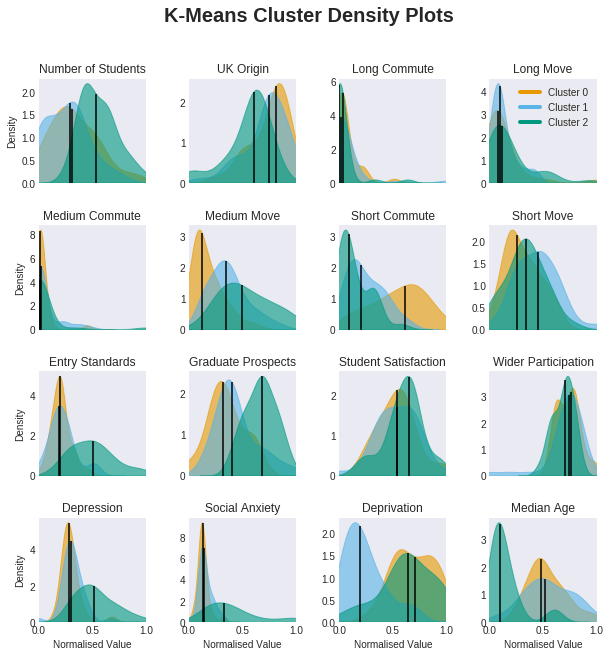
The top green cluster has the following characteristics:
- Highest number of students
- Lowest number of UK origin students (highest numbers of international students)
- Highest numbers of medium movers and lowest numbers of short commuters
- Highest entry standards and graduate prospects
- Highest rates of depression and social anxiety
- Lowest median age
The very low median age, high number of students, and high number of movers, (commuters are unlikely to show up at the GP nearest their university), suggest these points have an abnormally high proportion of students at these GPs. Therefore, explaining the highest rates of depression and social anxiety. In fact, a quick google suggests that many of the GPs with the highest rate of depression and social anxiety specialise in student health.
The remaining two clusters have similar higher median age distributions, making them more comparable, as they likely have similar numbers of students relative to the general population. There are differences in the number of medium movers, number of short commuters, and deprivation, but these clusters have similar distributions of depression and social anxiety. This suggests that the distance moved to university does not affect the rate of mental health issues, or offsets the effect of deprivation.
Regression
Another method we can use to understand the dataset is regression modelling. After testing a few methods, a decision tree seemed to work best. In the plot below, starting at the top box, is the first statement true or false? Proceed to the next box based on your answer, (left for true, right for false), repeat until you get to the final box in your chain.
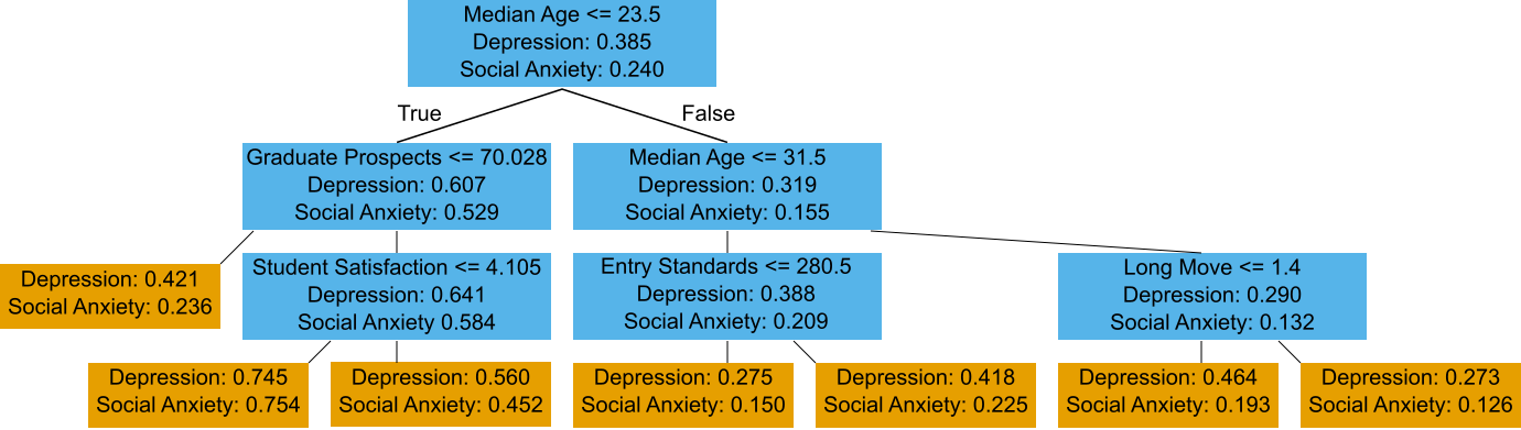
As in the clustering, the first split is in terms of median age: young people have more mental health issues than older people. In the high density of students branch, (left hand side), further division is done on the data from the university rankings: higher graduate prospects leads to higher rates of mental health problems, and subdividing that group again is done by student satisfaction: worse student satisfaction gives higher rates of mental illness.
High Student Density Areas
From the above analysis, the main difference in mental health issues is caused by the number of students in an area, rather than the distance the students moved. If we take a quick look within the K-means top green cluster, (the high density of students one), and those with a median age of less than or equal to 23.5 (as suggested by the first split in the decision tree), perhaps we can see differences within this small group where the student signal is clearest. Looking at the correlation matrices, (see below), most of the initial correlation of the mental health conditions with medium movers and short commuters disappears. This tells us that the initial correlation comes from better universities having more students that move into the local area, and students in general suffering from more mental health issues.
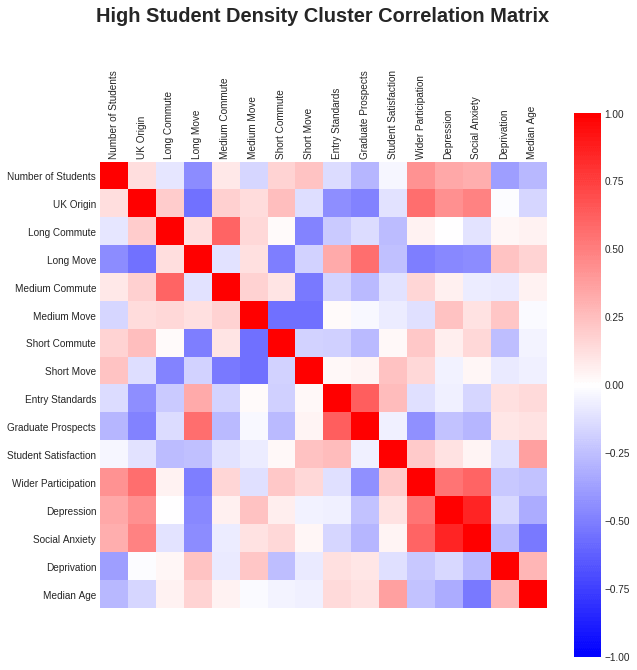

In the low median age group, correlation between the mental health conditions and graduate prospects and student satisfaction is present, (as seen by the divisions in the decision tree). Median age’s correlation is still there too though, perhaps this is just continuing to show that better universities attract more people to move to the local area, hence lowering the median age, and pushing up the rates of mental health conditions.
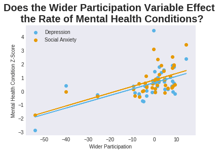
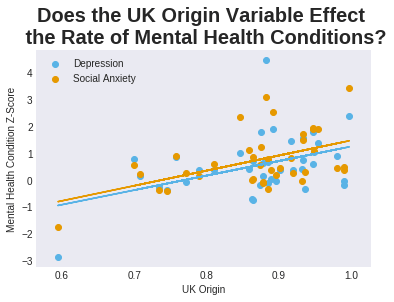
Though for the high student density cluster, a fairly strong anti-correlation between the mental health conditions with the number of long movers has appeared, as well as a strong correlation with wider participation and UK origin. Plotting these though, (see below), they are not very convincing, and since this is now a small sample, it is hard to identify the outliers.

Conclusions
Students in general suffer from mental health conditions more than the rest of general population, and the distance moved from their family does not have a major impact.
There is perhaps a hint of a relationship with long distance movers within the high density of students cluster, but this is too small a sample to draw conclusions from. In order to better explore this, different data would be beneficial: actual distance measures rather than short, medium, and long moves. In addition, a good way to remove the noise of the general population from the GP data would be to look at the rates of usage of university counselling services instead. This would only include students and would also include the commuters, who will just be too hard to find within the noise of the general population in the current dataset.
In terms of the immediately available datasets, it would also be good to look at monthly data: are there more prescriptions during exams? Or is it worse at the start of academic year as students move away for the first time?
Overall, we have seen the power of data science. What first looked like an interesting correlation between mental health conditions and more students moving rather than commuting, has been shown to be misleading. Whilst this work’s conclusions did not succeed in revolutionising the university mental health care system, perhaps with more university specific data, this kind of approach could reveal interesting relationships, and be the beginnings of a solution.
References
- https://yougov.co.uk/topics/lifestyle/articles-reports/2016/08/09/quarter-britains-students-are-afflicted-mental-hea
- https://www.bbc.co.uk/news/education-43739863
- https://www.theguardian.com/education/series/mental-health-a-university-crisis
- https://assets.publishing.service.gov.uk/government/uploads/system/uploads/attachment_data/file/771482/Community_Life_Survey_Focus_on_Loneliness_201718.pdf
- https://epi.org.uk/publications-and-research/prevalence-of-mental-health-issues-within-the-student-aged-population/
Acknowledgments
A special thanks goes to Matthew Boyd, who helped me find data and questioned my logic.
The Jean Golding Institute Data Competition
This project was one of our runners up into our recent ‘Loneliness for Education’ competition. We run various data competitions throughout the year – find out more