We are excited to announce that the winner of the 2019 JGI Beauty of Data competition is Vincent Cheng from Population Health Sciences with his visualisation project ‘Automated Forward Citation Snowballing using Google Scholar and Machine Learning’.
The winning visualisation is a short video, and you can view the full submission below:
About the winning project
This is an exploratory project that aims to understand how studies are being cited in Google Scholar, and to explore its application to evidence searches in a systematic review. In a systematic review, searching for studies is one of the most crucial steps. Although Google Scholar acts as a comprehensive database, its searching criteria and processing are not reproducible and transparent for conducting systematic reviews. This project uses a visualisation of a citation pattern in Google Scholar from a forward snowballing exercise (identifying new studies based on those papers citing the study being examined).
In the video, each node represents a search result (study) from Google Scholar. The size of a node represents the number of times a study has been cited. The width of an edge represents the number of duplicates. The visualisation demonstrates the search “Lassa fever ribavirin” on Google Scholar and extracted the first 10 search results as a start set (Iteration 0; n=10 as shown in the video). A trained machine learning model then selected potential studies based on the title, abstract, authors and journal of each study for the forward snowballing process. In each iteration, the information from the first 10 studies citing a potential study was extracted. After 10 iterations, there were n=4,765 search results (with n=1,384 unique results). The number of retrieved studies increased with each iteration. However, the number of duplicated studies also increased in later iterations, suggesting inefficient retrievals.
The data visualisation provides spatial relationships between each iteration in a chronological order to inspect the change. The results provide an insight into the Google Scholar search algorithm and help us to search and utilise the database more efficiently.
More about the competition
The winner received £100 in prize money and was invited to present his visualisation as a poster at the Data Visualisation Symposium at the Alan Turing Institute in London on 13 September 2019. You can take a look at the full poster of the winning visualisation here: Turing AI Symposium Poster.
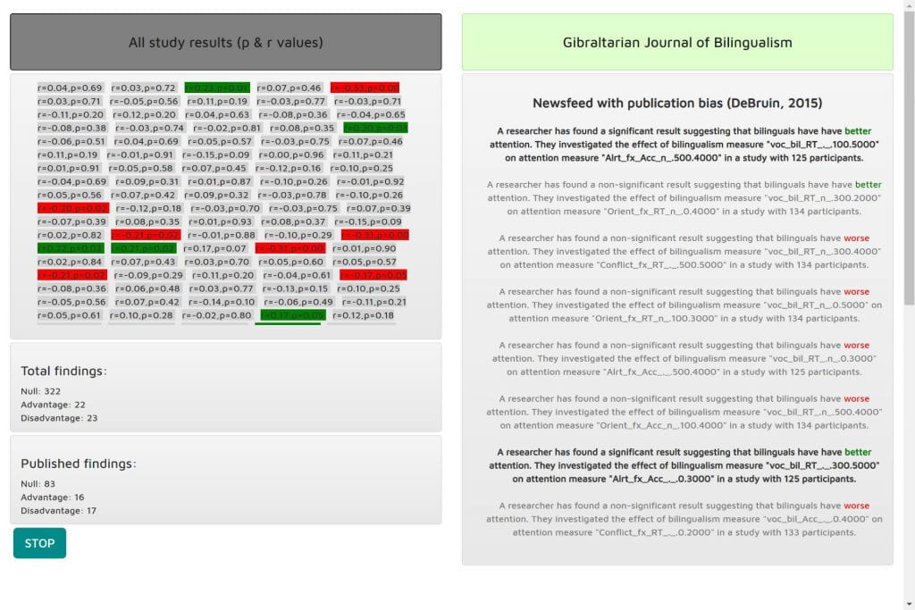
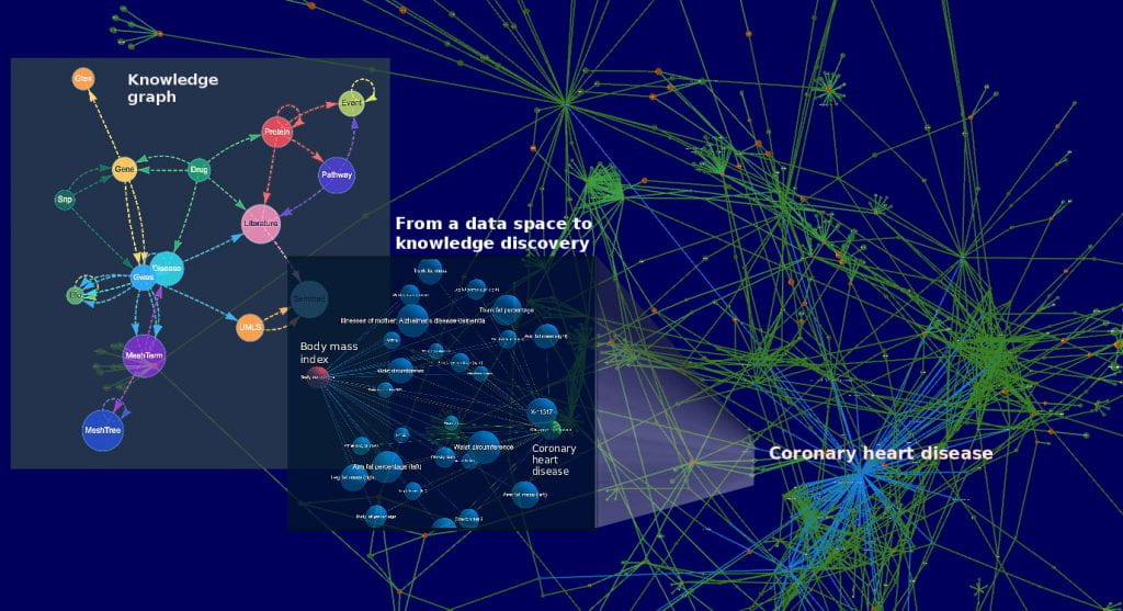
Two runners-up each receiving £50 each are Chris Moreno-Stokoe and Valeriia Haberland.
Take a look at their visualisations below:


The Jean Golding Institute Beauty of Data competition challenges staff and students to submit their work in this exciting challenge to find the best University of Bristol data visualisation. You take a look past entries on our Flickr page.
The Jean Golding Institute data competitions
We run a number of competitions throughout the year – to find out more take a look at Data competitions.

