

A blog written by James Boyd, Brunel Institute and Christopher Woods, University of Bristol.
Following many months of lockdown-based work, the Brunel’s Network project, conducted by the SS Great Britain Trust and University of Bristol collaboration, The Brunel Institute, is now available online.
The project aims to find, record, assess and weight the influence of all the individuals with whom Isambard Kingdom Brunel collaborated on major maritime engineering projects, and to display that network of individuals as a visual interactive. It began by as an idea by James Boyd, Research Fellow in the Brunel Institute, in 2018, and received a major boost in 2019 when Christopher Woods, EPSRC Research Software Engineering fellow, joined the project to help turn static network imagery into an interactive experience. The project was further accelerated in January 2020, with the support of a grant by the Jean Golding Institute, to add an additional project member, Gareth Jones.
The original aim of the project was to build an interactive digital exhibit that would be put on public display as part of this summer’s 50th Anniversary celebrations of Brunel’s second ship, the Great Britain, returning to Bristol. Members of the public would have interacted with the network via a large touch screen display. Gareth built a usable platform for Brunel’s Network over the Spring and early Summer. He realised the vision and, by the end of June, had turned the early prototype into a full production application.
However, as 2020 unfolded, the 50th Anniversary celebrations were postponed and opportunities to launch Brunel’s Network as an interactive public exhibit disappeared. More critically, it became clear that it would be challenging to make a large interactive touch screen safe for public use. In addition, socially-distanced working introduced significant obstacles. Before lockdown, much of the historical research needed for the Great Britain and Great Western networks was complete, but there was still a significant amount to do for the Great Eastern. Lockdown coupled with travel restrictions meant that, from March, archival work effectively came to a standstill, and so research into many historical figures represented in the network was slowed. Thanks to the work of UoB Special Collections archivist Emma Howgill, however, we were able to progress with a crucial element of the historical research. Emma has, in 2019 and 2020, done incredible work digitizing and transcribing the Great Eastern Letter Books – the company records behind Brunel’s third and most ambitious ship, the Great Eastern. With these sources, and regular online discussion to help build the digital interactive, the project has taken shape.
A key, yet difficult decision, was to pivot the project. The large touch screen was dropped, and instead we retargeted Brunel’s Network to run on personal touch screen devices, such as phones and tablets. This required a huge amount of work to reformat the application to support a range of much smaller display sizes, and to adapt from being an application run in a supervised way in an exhibit, into an application that an individual would explore at home. Examples of changes included adding code to automatically switch from writing the full names of individuals on the graph to writing their initials, if the screen size was small, to adding significantly more help and more intuitive controls and feedback. Another major, yet subtle, change, was to adapt the controls to better match the way users interact with phones or tablets, compared to traditional desktop interfaces. With these changes, we had an online application that was ready for launch.
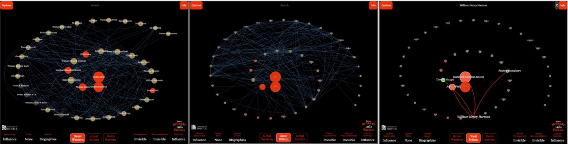
In addition to forcing changes of interface, the move to smaller and more variable display sizes exacerbated the principal challenge of visualising networks, namely that they become increasingly unreadable as the number of nodes and edges increases. While we had implemented filters to allow the public to reduce the number of visible nodes, initial user testing showed that the network was still too confusing, and we were falling into the trap of generating “spaghetti charts”.
To overcome this challenge, we had to come up with some innovative new ways of presenting network data. The network is distinguished from a standard social network diagram in that node gravity is determined by the influence of an individual in the group toward a given project, rather than their connectivity. This was achieved by putting information from the historical sources into a data model that counted their contributions toward the project. Whilst their social connectivity is also highlighted, (and can be used to centre the network), the goal was to examine the extent of investment, expertise and contribution of individuals within a group to a given historical outcome. With nodes sized by project influence, feedback from early users saw them trying to rank the nodes in the network into a visual hierarchy. To display this clearly, we needed to find a way of organising the nodes so that they were spaced out – thus avoiding “spaghetti plots” – but somehow still keeping nodes that represent individuals who made large contributions near the centre, while the nodes for those that contributed less were pushed outwards. Organising the nodes as a spiral, with the largest centred and the others spiralling outward, proved a solution. An algorithm was crafted, drawing inspiration from the spirals of a nautilus shell, that placed the nodes into a uniform spiral. This originated in the centre, with the node representing the individual who made the largest contribution to each ship. Subsequent nodes were placed along the spiral, in order of contribution. With a little tweaking based on user feedback, we reached a design that clearly showed the importance of contributions from individuals in Brunel’s Network, while still also showing the connections between individuals.

With the initial launch of the project now complete, we can now move onto the next stage. The goal is to make historical communities of innovation comprehensible and easy to explore in a visual format. Exploration of this data will give deep insight into the networks and relationships that drive success and failure in large historical projects. The project remains live, with much research to be added and further updates to usability and modes of data visualisation. The project team hope that both a webinar programme and series of lectures in early 2021 will give a platform to help interested users explore it in depth. In the meantime, the project is open for historians, SNA enthusiasts and of course Brunel enthusiasts to explore:
To keep up to date with this and other projects, news, events, funding and other opportunities please Join the JGI Mailing list.