We created a web application that enables interactive access to climate research data to enhance scientific collaboration and public outreach.
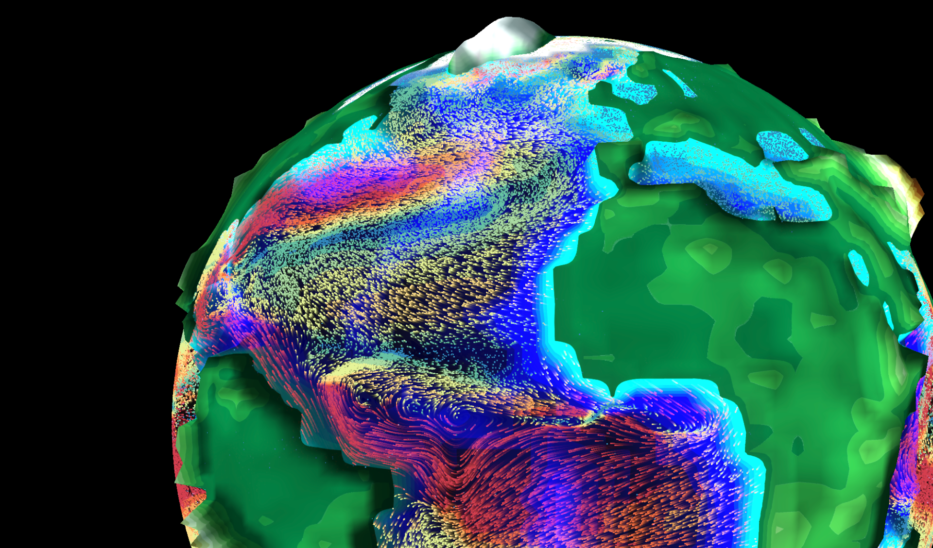
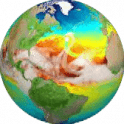
Screenshot of the app showing surface ocean currents (coloured by magnitude) of the present-day Atlantic Ocean.
Climate model data for everyone
We can only fully understand the past, present and future climate changes and their consequences for society and ecosystems if we integrate the expertise and knowledge of various sub-disciplines of environmental sciences. In theory, climate modelling provides a wealth of data of great interest across multiple disciplines (e.g., chemistry, geology, hydrology), but in practice, the sheer quantity and complexity of these datasets often prevent direct access and therefore limit the benefits for large parts of our community. We are convinced that reducing these barriers and giving researchers intuitive and informative access to complex climate data will support interdisciplinary research and ultimately advance our understanding of climate dynamics.
Aims of the project
This project aims to create a web application that provides exciting interactive access to climate research data. An extensive database of global paleoclimate model simulations will be the backbone of the app and serves as a hub to integrate data from other environmental sciences. Furthermore, the intuitive browser-based and visually appealing open access to climate data can stimulate public interest, explain fundamental research results, and therefore increase the acceptance and transparency of the scientific process.
Technical implementation
We developed a completely new, open-source application to visualise climate model data in any modern web browser. It is built with the JavaScript library “Three.js” to allow the rendering of a 3D environment without the need to install any plug-ins. The real-time rendering gives instantaneous feedback to any user input and greatly promotes data exploration. Linear interpolation within a series of 109 recently published global climate model simulations provides a continuous timeline covering the entire Phanerozoic (last 540 million years). Model data is encoded in RGBA colour space for fast and efficient file handling in mobile and desktop browsers. The seed corn funding enabled the involvement of a professional software engineer from the University of Bristol Research IT. This did not only help with transferring our ideas into a website but also ensured a solid technical foundation of the app which is crucial for future development and maintainability. In particular, a development workflow using a Docker container has been implemented to simplify sharing and expanding the app within the community.
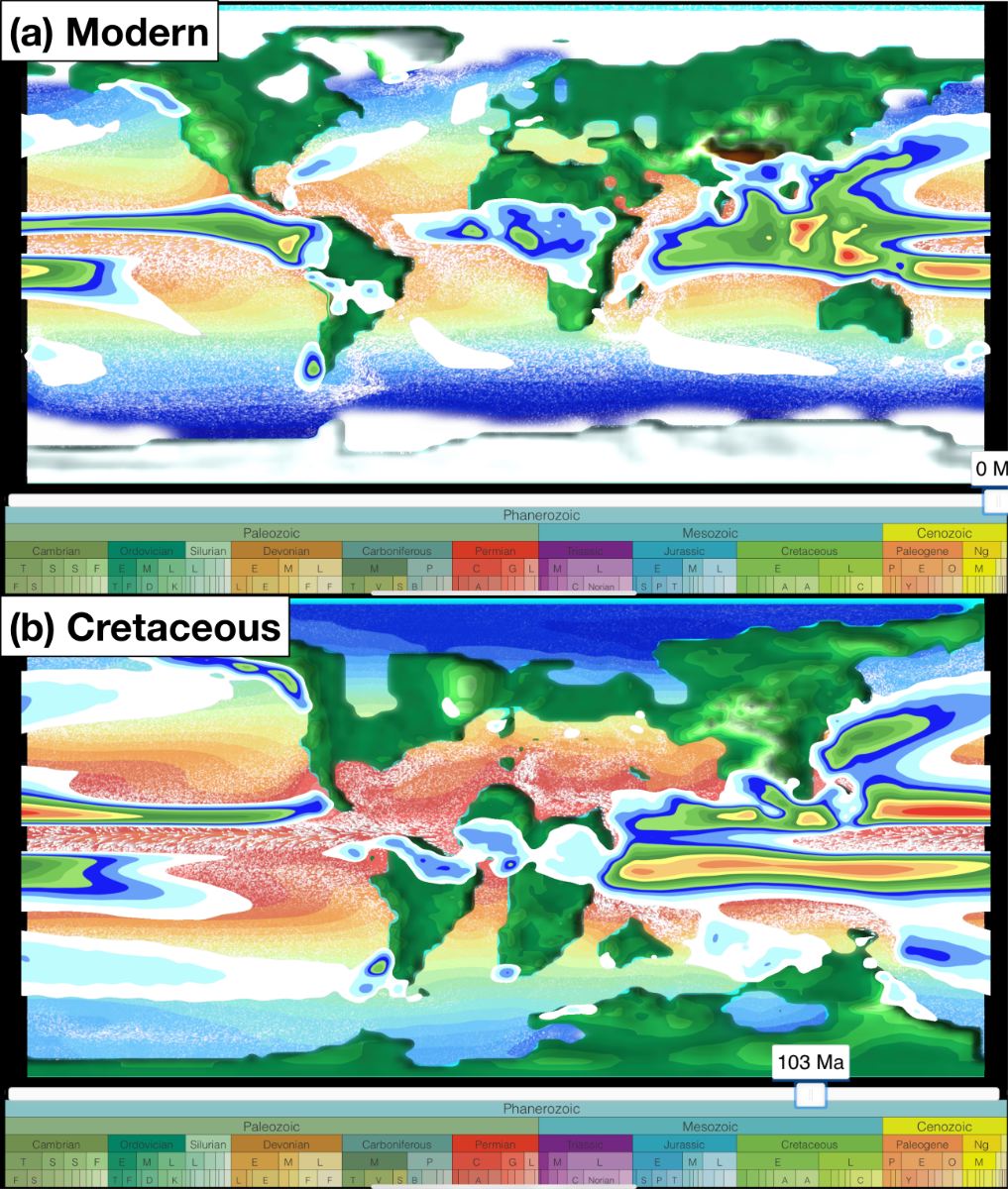
Screenshots of the app for the present day and the ice-free greenhouse climate of the mid-Cretaceous (~103 Million years ago). Shown are annual mean model data for sea surface temperature, surface ocean currents, sea and land ice cover, precipitation, and surface elevation
Current features
The app allows the visualisation of simulated scalar (e.g., temperature and precipitation) and vector fields (winds and ocean currents) for different atmosphere and ocean levels. The user can seamlessly switch between a traditional 2D map and a more realistic 3D globe view and zoom in and out to focus on regional features. The model geographies are used to vertically displace the surface and to visualise tectonic changes through geologic time. Winds and ocean currents are animated by the time-dependent advection of thousands of small particles based on the climate model velocities. This technique – inspired by the “earth” project by Cameron Beccario – greatly helps to communicate complex flow fields to non-experts. Individual layers representing the ocean, the land, the atmosphere, and the circulation can be placed on top of each other to either focus on single components or their interactions. The user can easily navigate on a geologic timescale to investigate climate variability due to changes in atmospheric CO2 and paleogeography throughout the last 540 million years.
Next steps
The first public release of the “climatearchive.org” app is scheduled for autumn 2021. This version will primarily showcase the technical feasibility and potential for public outreach of the app. We anticipate using this version to acquire further funding for developing new features focusing on the scientific application of the website. First, we plan to add paleoclimate reconstructions (e.g., temperature) for available sites across geologic time. The direct comparison with the simulated model dynamics will be highly valuable for assessing the individual environmental setting and ultimately interpreting paleoclimate records. Secondly, we will generalise the model data processing to allow the selection and comparison of different climate models and forcing scenarios. Thirdly, we aim to provide the ability to extract and download model data for a user-defined location and time. We see the future of the app as a user-friendly interface to browse and visualise the large archive of available climate data and finally download specific subsets of data necessary to enable quantitative interdisciplinary climate research for a larger community.
Contact details and links
Sebastian Steinig, School of Geographical Sciences
sebastian.steinig@bristol.ac.uk
The public release of the website (https://climatearchive.org/) and source code (https://github.com/sebsteinig) is scheduled for autumn 2021.