The University of Bristol's central hub for data science and data-intensive research, connecting a multidisciplinary community of experts across the University and beyond.
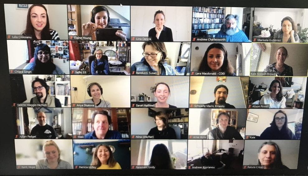
My name is Ralph Ward and I am currently studying for a Masters in Anthropology at the University of Bristol. I have just completed a 4-month placement supporting the development and operation of a Social Justice and AI Workshop for the GW4 Data Science Network .
I am just about to start research for my dissertation exploring the notion of Ethnic Invisibility among diasporic Filipinos living in the United Kingdom. Being half Filipino myself, I have always been curious about my heritage. With the world becoming an increasingly transnational community, I believe that conversations about ethnic identity and heritage are incredibly important. My research interests also include museums, heritage work and conservation management. Completing this placement has allowed me to take away many new skills in IT and data population as well as developed interpersonal, time management and problem-solving skills. I am certain that these skills will assist me with the completion of my dissertation project as well as future employment prospects.
One of the main things that stood out to me when organising the workshop was the importance of teamwork, especially when it comes to planning an event online. Although due to the COVID 19 restrictions we were not able to meet in person, the team was extremely proactive in making sure we stayed connected virtually. This was valuable and helped me feel part of the team. I am extremely grateful for the level of responsibility that was given to me during my time with JGI, right from the initial brainstorming stage. I was involved in the background research of prospective attendees, the event planning itself and assisted in running the event on the day.
Overall, I feel that the workshop was a great success. There was a huge turnout from a range of disciplines within the GW4 network and external organisations. The workshop brought about a series of productive speed-networking sessions which gave lots of food for thought for potential collaborative ideas. The workshop was filled with a range of talks from topics like algorithmic bias in decision making, data justice in Mexico’s multiveillant society and Networking With Care: Exploring Data and AI Ethics research practices
I would like to thank Kate Robson Brown and Patty Holley from the Jean Golding Institute for providing the opportunity to work on such an exciting event and lastly Chiara, Elaine and Lily for being such a fantastic team to work with!
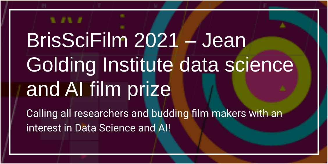
We are very excited to announce that we are collaborating with Bristol Science Film Festival, every year they run a science film competition to encourage and support all filmmakers. It is open to amateur and experienced film makers; the shortlisted films are screened on the Big Screen in Bristol and at a special film-makers screening during the festival.
The JGI are contributing an additional prize this year for a short film submitted to the competition with a data science or artificial intelligence theme. We will award £150 to the winner and £50 to the runner up.
We are interested in seeing your short science fiction or fact films on a data theme. These could explore data ethics, how the information age has affected the spread of misinformation, or how data science and AI is positively changing our lives now and in the future.
The winning film will also be screened during our Data Week Online 2021 (14th-18th June). To be considered, just submit your film to the Bristol Science Film Festival via FilmFreeway and you’ll automatically be considered for this prize.
Already submitted your film? We don’t make final decisions until after the competition closing date of May 1st, 2021. If you have already submitted your film on a data science-related topic, it’ll automatically be eligible for the Jean Golding Institute prize.
Any questions, please get in touch (bristolsciencefilmfestival@gmail.com) Good luck!
The Jean Golding Institute is delighted to announce the winners of the Seed Corn Funding call 2021.
We are very grateful to our community as we received so many high-level applications during these challenging times and were able to select 12 fantastic projects.
This funding call aims to support activities to foster interdisciplinary research in data science (including AI) and data-intensive research.
It has now been successfully running for last four years and the Jean Golding Institute has funded a total of 42 seed corn projects (you can see the outputs of the projects on our website).
Our winners this year are:
Chris Mc Williams (Engineering Maths) with ‘The ‘symbolic annihilation of women’ in primary school literature.’
Christopher Williamson and Matthew Jones (Geographical Sciences) with ‘Convolutional Neural Networks for Environmental monitoring’
Richard Owen, Vivienne Kuh and James Ladyman (Management) with ‘What is the best relationship between humans and AI? Investigating researcher perceptions of AI through immersive experience.’
Cheryl McQuire, Luisa Zucculo, Christopher Woods and Mike Jones (Centre for Public Health / Bristol Medical School) with ‘Pandemics and ‘infodemics’: the nature, extent and reach of public health misinformation on social media during the COVID-19 pandemic.’
Valerrio Maggio, Oliver Davis and Claire Haworth (MRC Integrative Epidemiology Unit / Bristol Medical School) with ‘Secure machine learning on sensitive ground truth data held by UK birth cohorts’
Sam Gunner, Ella Voyagaki and Maria Pregnolato (Engineering) with ‘A Digital Twin Enabler for the Clifton Suspension Bridge: an open-interface structural model’
Kevon Parmeser (Bristol Medical School) with ‘Evaluating fairness, bias and equality in Artificial Intelligence for skin disease.’
Sebastian Steinig, Dan Lunt, Kieren Pitts and Caitlyn Witkowski (Geographical Sciences) with ‘Earth’s climate at your fingertips: connecting multidisciplinary environmental sciences and the public through interactive data exploration’
Ahmed Elkaheen and Matteo Sattler (MRC Integrative Epidemiology Unit / Bristol Medical School) with ‘Effects of adolescent physical activity on physical and mental health in adulthood: novel multivariate pattern analysis of the intensity spectrum’
Denize Atan and Neil Davies (Translational Health Sciences / Bristol Medical School) with ‘Non-invasive imaging of the eye to predict Alzheimer’s disease’
Pau Erola, Tom Gaunt and Richard Martin (Population Health Science / Bristol Medical School) with ‘Pilot Assessment of Cancer Risk After SARS-COV-19′
Xin Fei and Xiaojun Wang (Management) with ‘The effective deployment strategy of COVID-19 vaccines with various efficacies to mitigate the impacts of pandemic in the UK’
We are excited to hear how all these projects progress this year and will report back on their work in the summer of 2021. Our next Seed corn funding call will be in the Autumn of 2021.
To ensure you keep up to date with any other funding calls, news, events and other opportunities, please join the JGI mailing list.
Dr Genevieve Liveley and Professor Awais Rashid are part of the team of the newly launched ESRC Digital Security by Design Social Science Hub+, DiScriBe, a four year project to bring social science, humanities and computer science together to address the challenges of digital security.DiScriBe Hub+ is one of two programmes of research and development announced by UK Research and Innovation, as part of the Industrial Strategy Challenge Fund (ISCF) “Digital Security by Design” (DSbD) programme to prevent the prevalence of damaging cyber security attacksby applying social and economic science to core questions around the adoption of new secure technologies, the readiness of different sectors (and roles) to adopt new secure hardware, the regulatory and policy environment and how that might influence the adoption of DSbD Tech, and what social and cultural factors might influence the success of the wider DSbD ecosystem.
Led by Professor Adam Joinson at the University of Bath, in collaboration with the Universities of Bristol, Cardiff, and Royal Holloway University of London, this project aims to reshape the ways in which social sciences and STEM disciplines work together to address the challenges of digital security.
There is a current commissioning call for scoping reviewsaround our four key topic areas, with the goal to understand the current state of knowledge and areas with no evidence base:
Economics of security hardware adoption: quantifying costs and benefits Under this call topic area, we are seeking a review of existing methods for identifying and quantifying the costs and benefits of adoption of new security hardware and practices. The identification should be done under a broad scope, for instance the benefits should encompass reducing the expected loss in terms of direct and indirect costs of cybersecurity failure, and importantly, in addition to private costs, externalities should also be considered and analysed.
Understanding secure and insecure practices across consumer chains of hardware security advances Under this topic area, we require a systematic mapping of the consumer chains that will potentially utilise hardware security advances. The focus of the scoping research should be on understanding how secure (or insecure) practices currently manifest across the complex intersections inherent in these consumer chains. These consumer chains encompass infrastructure developers who aggregate a range of hardware and software services to deliver critical systems, e.g., smart city environments, smart grids, intelligent transportation, etc. as well as those who deliver consumer goods ranging from personal computers and devices to Internet of Things (IoT).
Regulation, Policy and Cybersecurity We are seeking to commission research on the regulatory landscape within the UK digital security sector. The focus should be on the design and use of hardware security as part of digital products and services. The regulatory landscape encompasses legislation, standards and regulation.
Social and Cultural Differences in the Adoption of Security Technologies We intend to conduct a survey to understand the difference between social, cultural and commercial barriers to adoption of secure tech (i.e. CHERI and associated hardware/software) between sectors. In preparation we need to identify the potential adopters of secure technology – from manufacturers and open source communities, to end users (private, public and third sectors). Specifically, given we cannot survey all sectors, we aim to identify which to focus on through a scoping exercise to determine those that will likely achieve the highest impact from secure technology adoption. Full call: https://www.discribehub.org/commissioning-call-october-2020
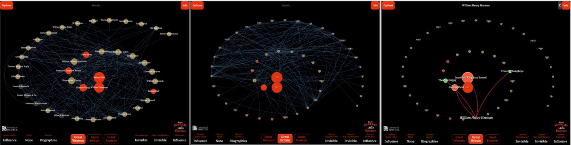
Figure 1: Three views of Brunel’s Network running on an iPhone X. Transitioning a public engagement project from being based on a large touch-screen display to using phones and tablets forced a significant redesign and rethink of the project. The result is a more personal and intuitive app for exploring the network of human interactions that drove the construction of Brunel’s three great ships
A blog written by James Boyd, Brunel Institute and Christopher Woods, University of Bristol.
Following many months of lockdown-based work, the Brunel’s Network project, conducted by the SS Great Britain Trust and University of Bristol collaboration, The Brunel Institute, is now available online.
The project aims to find, record, assess and weight the influence of all the individuals with whom Isambard Kingdom Brunel collaborated on major maritime engineering projects, and to display that network of individuals as a visual interactive. It began by as an idea by James Boyd, Research Fellow in the Brunel Institute, in 2018, and received a major boost in 2019 when Christopher Woods, EPSRC Research Software Engineering fellow, joined the project to help turn static network imagery into an interactive experience. The project was further accelerated in January 2020, with the support of a grant by the Jean Golding Institute, to add an additional project member, Gareth Jones.
The original aim of the project was to build an interactive digital exhibit that would be put on public display as part of this summer’s 50th Anniversary celebrations of Brunel’s second ship, the Great Britain, returning to Bristol. Members of the public would have interacted with the network via a large touch screen display. Gareth built a usable platform for Brunel’s Network over the Spring and early Summer. He realised the vision and, by the end of June, had turned the early prototype into a full production application.
However, as 2020 unfolded, the 50th Anniversary celebrations were postponed and opportunities to launch Brunel’s Network as an interactive public exhibit disappeared. More critically, it became clear that it would be challenging to make a large interactive touch screen safe for public use. In addition, socially-distanced working introduced significant obstacles. Before lockdown, much of the historical research needed for the Great Britain and Great Western networks was complete, but there was still a significant amount to do for the Great Eastern. Lockdown coupled with travel restrictions meant that, from March, archival work effectively came to a standstill, and so research into many historical figures represented in the network was slowed. Thanks to the work of UoB Special Collections archivist Emma Howgill, however, we were able to progress with a crucial element of the historical research. Emma has, in 2019 and 2020, done incredible work digitizing and transcribing the Great Eastern Letter Books – the company records behind Brunel’s third and most ambitious ship, the Great Eastern. With these sources, and regular online discussion to help build the digital interactive, the project has taken shape.
A key, yet difficult decision, was to pivot the project. The large touch screen was dropped, and instead we retargeted Brunel’s Network to run on personal touch screen devices, such as phones and tablets. This required a huge amount of work to reformat the application to support a range of much smaller display sizes, and to adapt from being an application run in a supervised way in an exhibit, into an application that an individual would explore at home. Examples of changes included adding code to automatically switch from writing the full names of individuals on the graph to writing their initials, if the screen size was small, to adding significantly more help and more intuitive controls and feedback. Another major, yet subtle, change, was to adapt the controls to better match the way users interact with phones or tablets, compared to traditional desktop interfaces. With these changes, we had an online application that was ready for launch.
Figure 2: Brunel’s Network running on an iPad. The application has a fully responsive design. Full names displayed for smaller networks (left), and only initials for larger networks (middle). Full names are used, together with highlighted edges, when users select a node.
In addition to forcing changes of interface, the move to smaller and more variable display sizes exacerbated the principal challenge of visualising networks, namely that they become increasingly unreadable as the number of nodes and edges increases. While we had implemented filters to allow the public to reduce the number of visible nodes, initial user testing showed that the network was still too confusing, and we were falling into the trap of generating “spaghetti charts”.
To overcome this challenge, we had to come up with some innovative new ways of presenting network data. The network is distinguished from a standard social network diagram in that node gravity is determined by the influence of an individual in the group toward a given project, rather than their connectivity. This was achieved by putting information from the historical sources into a data model that counted their contributions toward the project. Whilst their social connectivity is also highlighted, (and can be used to centre the network), the goal was to examine the extent of investment, expertise and contribution of individuals within a group to a given historical outcome. With nodes sized by project influence, feedback from early users saw them trying to rank the nodes in the network into a visual hierarchy. To display this clearly, we needed to find a way of organising the nodes so that they were spaced out – thus avoiding “spaghetti plots” – but somehow still keeping nodes that represent individuals who made large contributions near the centre, while the nodes for those that contributed less were pushed outwards. Organising the nodes as a spiral, with the largest centred and the others spiralling outward, proved a solution. An algorithm was crafted, drawing inspiration from the spirals of a nautilus shell, that placed the nodes into a uniform spiral. This originated in the centre, with the node representing the individual who made the largest contribution to each ship. Subsequent nodes were placed along the spiral, in order of contribution. With a little tweaking based on user feedback, we reached a design that clearly showed the importance of contributions from individuals in Brunel’s Network, while still also showing the connections between individuals.
Figure 3: Evolution of Brunel’s Network. The left panel shows the version of Brunel’s Network from June running on an iPad. The smaller screen leads to issues with rendering, plus a “spaghetti-graph” view. The second panel shows how we had evolved to use a spiral view by July, with the third panel showing the adoption of a responsive layout in the August version that adapted the controls based on screen dimensions.
With the initial launch of the project now complete, we can now move onto the next stage. The goal is to make historical communities of innovation comprehensible and easy to explore in a visual format. Exploration of this data will give deep insight into the networks and relationships that drive success and failure in large historical projects. The project remains live, with much research to be added and further updates to usability and modes of data visualisation. The project team hope that both a webinar programme and series of lectures in early 2021 will give a platform to help interested users explore it in depth. In the meantime, the project is open for historians, SNA enthusiasts and of course Brunel enthusiasts to explore: