What is data? Exploring data from an anthropological perspective

TDWI 2019

Blog written by Josie Price, University of Bristol graduate

Introduction

Humans are repeatedly living through and creating data, yet the uses of data have also become a source of economic, political, psychological and social power. So, what really is data?

My final year thesis for my Anthropology with Innovation degree aimed to investigate this question using an ethnography with data scientists combined with the theory of ontology. This was to better understand the multiplicity of data and its relationship to humans in contemporary western societies.

Aims of the project

  • Use my ethnography with data scientists to answer the question: What is Data?
  • Investigate the role of data in contemporary societies, where data can be human experience as well as an economy, commodity and political tool.
  • Better understand how data transitions into these multiple forms.
  • Combine the study of data with the theory of ontology to understand data from a social anthropological perspective.
  • Better understand the relationship between humans and data.

Results

What is data?

To investigate what data is, I conducted one-to-one interviews with data scientists who work to translate data into significant, meaningful results. The most significant theme was that data scientists understand data to be a model of reality. This is because data scientists understand data as multidimensional, but condensed into a ‘picture’ to provide meaning and structure to the data. This is to better comprehend what the data means, but when situated in ontological theory this functional process has parallels with Viveiros de Castro’s (1998) theory of Perspectivism that is evident in Amerindian ontologies.

Data is a model of reality

This ontology of data as a “picture” of the world can therefore help to explain the multiplicity of data because data is an abstraction of reality. Therefore, data can manifest through multiple forms as models of reality – be it to monitor human behaviour; inform a political strategy or to create an economic marketplace – changing depending on the context and purpose of the data. The ontology of data as a model of reality reveals parallels with the Ontological Turn in anthropology. The Ontological Turn argues that different worlds are experienced simultaneously, thereby denying the existence of a ‘singular truth’ and revealing the presence of dominant models that pervade society (Holbraad and Pedersen, 2017; Escobar, 1995). Likewise, data scientists’ ontology of data as a model reality helps to understand that there is not a singular truth of what data is, but data can be expressed in multiple forms depending on the context and purpose.

It is important to note that this model is not reality; it is a “picture” of reality where multi-dimensions have been condensed and distorted by human effort. This analysis helps to relocate the human in this phenomenon because these models are shaped by humans. Therefore, for data scientists, data is also something to be critical of. This ontology of data reveals the importance of a critical community, favouring error over truth and immersing in the specific domain knowledge. These are all vital components to construct models that are closer to reality.

Humans and data

This analysis of data as a model of reality therefore helps to relocate the human in the phenomenon because humans create these models of reality to provide meaning to the data. In this sense, this ontology where data carries the influence of humans could indicate a convergence of humans and non-humans, indicating a shift from ‘The Great Divides’ prominent in western ontology (Latour, 1991). The influence of humans on data further supports how data is something to be critical of, although whether this critical ontology of data is shared with the wider public is not known and is a topic for further research. Nevertheless, from the ontology of data amongst data scientists, we can learn how reality needs to constrain a model for it to be meaningful. This can help data scientists use data to create models that are closer to reality to provide richer insight to questions about the world.

Future plans

To continue the trajectory of data as models of reality, further plans for this project could be to investigate how these models of reality can affect the structures of society. For example, the relationship between data and gender and the subsequent sexism in digital technologies and data analysis could be further researched, as explored by Caroline Criado Perez in her book ‘Invisible Women’. Therefore, a question to be explored could be: ‘How does data, and digital technologies such as AI and Machine Learning, reinforce dominant structures through technology?’. This could reveal further insight into how data is understood and the relationship between humans and data.

Contact

pricejosie10@gmail.com


Food hazards from around the world Data Competition

We are excited to announce the winner of the 2020 Food hazards from around the world data competition is Robert Eyre with his visualisation project ‘FSA related alert tracker’. 

The Jean Golding Institute recently teamed up with the Food Standards Agency (FSA) for a data visualisation competition 

The competition

Every day the Food Standards Agency receives alerts from around the world about food products that have been found to be hazardous to human health, from salmonella in chicken to undeclared peanuts to plastic in pickles. Sometimes these products make it to our shelves in the UK and have to be recalled or withdrawn. But with so much data on food hazards at our fingertips, we want to be proactive in identifying potential hazards to UK consumers, before anyone buys a hazardous product.  

The FSA made a dataset of food alerts available and we asked for data visualisations that could help to understand how the dataset might alert us to food risks.

The winning project

The winner was Robert Eyre, PhD student, Department of Engineering Mathematics with his visualisation FSA related alert tracker.

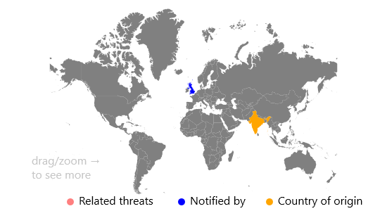
The visualisation is a dashboard that allows the FSA to identify threats that are related. Once an article about a threat has been chosen, you can see where on the map, and where in time related threats happened.

The idea behind the visualisation is to show the threats that had been reported in the United Kingdom, and that given a threat, it should show the other threats related to it. Once a threat has been selected from the left panel, the right panel will automatically update, showing the data source, a link to the data source and information about the incident, such as when the article was published, and what the incident is about. Then, the map will highlight the source of the threat, and the country that reported the threat.

To then show the related threats, there are a series of buttons under the left panel to decide what is classed as a related event. Once one of these buttons are selected, the map is updated to show the locations of the related threats (and roughly how many threats there are by the size of the new circles). This should show the FSA where specific threats are most common when related to the United Kingdom. Additionally, a time series is shown for the related events highlighted. Here the FSA could identify any peaks or dips, that they could then investigate further for events that may have happened.


Image from Visualisation


The winner received £1000 in prize money

The runners up

Two runners-up each receiving £250 are Marina Vabistsevits & Oliver Lloyd and Angharad Stell.

Marina and Oliver received runner up for their visualisation, ‘Too much tooty in the fruity: Keeping food safe in a post-Brexit BritainA brief exploration of the UK’s reliance on the EU for food safety, and the related challenges that Brexit may bring.  

Angharad received runner up for the visualisation From a data space to knowledge discovery An interactive plotting app that allows exploration and visualisation of the dataset. 

The Jean Golding Institute data competitions 

We run a number of competitions throughout the year – to find out more take a look at Data competitions. 

Storing your data in a spreadsheet


Photo via Unsplash by Glenn Carstens-Peters

Blog written by Jonty Rougier, Lisa Müller, Soraya Safazadeh, Centre for Thriving Places (the new name for Happy City)

What makes a good spreadsheet layout?

We were recently trying to extract some data from the All tab of the ONS spreadsheet Work Geography Table 7.12 Gender pay gap 2018

This gave us the opportunity to reflect on what makes a good spreadsheet layout, if you want to make your data easily available to others. The key thing to remember is that the data will be extracted by software using simple and standardised rules, either from the spreadsheet itself, or from a CSV file saved from the spreadsheet. Unless you recognise this, much of your well-intentioned structure and ‘cool stuff’ will actively impede extraction. Here are some tips for a good spreadsheet:

Names

Each of your data columns is a ‘variable’, and starts with a name, giving a row of variable names in your spreadsheet. Don’t use long names, especially phrases, because someone is going to have to type these later. Try to use a simple descriptor, avoiding spaces or commas; if you need a space or some other punctuation, use an underscore instead (see below). You can put detailed information about the variable in a separate tab. This detailed information might include a definition, units, and allowable values.

In our example spreadsheet we have

Current column name Our description Better column name
Description Region names Region_name
Code Region identifiers Region_ID
Gender pay gap median Numerical values GPG_median
Gender pay gap mean Numerical values GPG_mean

There is a mild convention in Statistics to use a capital letter to start a variable name, and then small letters for the levels, if they are not numerical. For example, the variable ‘Sex’ might have levels ‘male’, ‘female’, ‘pref_not’, and ‘NA’, where ‘pref_not’ is ‘prefer not to say’, and NA is ‘not available’.

  1. Use an IDENTICAL name for the same variable if it appears in two or more tabs. It’s amazing how often this is violated: identical means identical, so ‘Region_Name’, ‘region_Name’, and ‘region_name’ are NOT the same as ‘Region_name’.
  2. There are two different conventions for compound variable names, like ‘Region name’. One is to replace spaces with underscores, to give ‘Region_name’. The other is to remove spaces and use capitals at the start of each word, to give ‘RegionName’, known as camel case. Both are fine, but it is better not to mix them: this can cause some old-skool programmers to become enraged.

Settle on a small set of consistently-used codes for common levels

NA for ‘not available’ is very common; in a spreadsheet, you can expect a blank cell to be read as NA. ‘Prefer not to say’ comes up regularly, so settle on something specific, like ‘pref_not’, to be used for all variables. The same is true for ‘not sure’ (eg ‘not_sure’).

At all costs, avoid coding an exception as an illegal or unlikely value, like 9, 99, 999, 0, -1, -99, -999; we have seen all of these, and others besides (from the same client!). If you want to use more exceptions than just NA in a variable with numerical values, then use NA for all exceptions in the values column, and add a second column with labels for the exceptions.

In our example spreadsheet, if you look hard enough you will see some ‘x’ in the numerical values columns. We initially guessed these mean ‘NA’, but in fact they do not! In the key, ‘x = Estimates are considered unreliable for practical purposes or are unavailable’. But surely ‘unreliable’ and ‘unavailable’ are two different things? Ideally only the second of these would be NA in the GPG_median numerical column. A new GPG_median_exception column would be mostly blank, except for ‘unreliable’ where required to qualify a numerical value.

Generally, we prefer a single column of exceptions, possibly with several levels. In another application the exception codes included ‘unreliable’, ‘digitised’, ‘estimate’, and ‘interpolated’.

Put all meta-data ABOVE the rows which store the data

This is because extraction software will have a ‘skip = n’ argument, to skip the first n rows. So everything which is not data should go up here, to be skipped.

  1. DO NOT use the columns to the right of your data: the extraction software will not understand, and try to extract them as additional columns.
  2. DO NOT use the columns underneath your data, for the same reason. Your variables will be contaminated, usually with character values which stop the columns being interpreted by the extraction software as numerical values.

In our example spreadsheet, there is a ‘Key to Quality’ to the right of the columns. Clearly the author of this spreadsheet was trying to be helpful, but this information is already in the Notes tab, and the result is distinctly unhelpful.

In our example spreadsheet we also have three rows of footnotes immediately underneath the data. The correct place for these is in the Notes tab, or above the data.

Do not embed information in the formatting of the cells

This is an unusual one, but our example spreadsheet has done exactly that. Instead of an additional column Quality, the author has decided to give each numerical value cell one of four colours, from white (good quality) to deep red (either unreliable or unavailable). This is useful information but it is totally inaccessible: cell format like colour is not read by extraction software.

Don’t have any blank rows between the row of variable names and the last row of data

This is not crucial because extraction software can be instructed to skip blank rows, but it is better to be safe.

Our example spreadsheet has no blank rows – result!

More information

For more information about Centre for Thriving Places check out their website


Optimization of ultra-thin radiation resistant composites structures for space applications

Composites have been used for space applications due to their high performance properties. However, the environmental conditions experienced during space exposure lead to severe structural damage.

Blog by Mayra Rivera Lopez, PhD Researcher, Bristol Composites Institute (ACCIS) Advanced Composites Collaboration for Innovation and Science, Department of Aerospace Engineering, University of Bristol

This project was awarded seed corn funding from the new Jean Golding Institute Post Graduate Researchers seed corn award scheme 2020.

Project aims

  • Select current ultra-thin carbon fibre reinforced composites (CFRP) based on thermoset resins used to manufacture space deployable structures. The presence of nanofillers on these resins will be considered for some samples.
  • Set the selected CFRPs samples in a plasma generator chamber to simulate space exposure at a low Earth orbit for up to twelve months.
  • Perform 3D surface topography analysis by using the Alicona Infinite focus microscope on each sample. These tests will identify any surface imperfection on the composites, leading to a deterioration of their mechanical properties.
  • The overall void volume will be analysed and identify significant resin modifications which could act as a focal point for crack propagation or radiation damage.
  • Collect infrared analysis data from these composites before and after being exposed to plasma conditions (available from previous experiments at the University of Bristol).
  • Create a correlation between the chemical structure of the resins obtained from the infrared data and the voids presence.
  • Create a database to predetermine the best thermoset overall performance for space structures applications and establish how to optimise it.

Results

Materials Selection and Atomic Oxygen Exposure Details

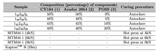
Two different epoxy composites were selected to be analysed, including CY 184, Aradur 2954 and MTM44-1 materials. EP0409 Glycidyl POSS nanofillers at different contents (0, 5, 10, 15, and 20 wt%) were applied to these. The convention (1x2y3z) was selected where the subscripts display the content of each component. Moreover, two curing techniques were applied, the use of autoclave and compression plates. Table 1 displays the composition and manufacturing details of the laminates.

Table 1: Composition of the composites resins

A JLS Designs Plasmatherm 550–570 radio frequency plasma generator was used to expose the samples to Atomic Oxygen (AO). A frequency of 150 W, constant pressure of 100 Pa and a constant O2 flow of 0.3 NL/min were applied to simulate space conditions for an equivalent of twelve months.

Surface Roughness Analysis

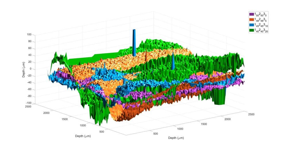
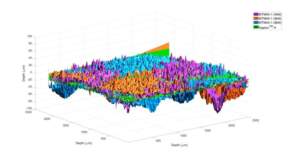
The 3D Surface topography images were obtained from scanned composite areas of 2.5mm × 2.5mm after AO exposure. An Alicona Infinite Focus instrument with a 5× objective was used to characterise the samples. The overall void volume was calculated on Matlab by using the 3D dataset files obtained for each sample and an average depth 2D threshold of each sample. On Figure 1, the composites depressions are observed due to the resin degradation after exposure. On Table 2 the overall void content for each sample is presented. The laminates containing POSS(3) have a smoother pattern (except 180280320) compared to the laminates with only MTM44-1 (including 4kN, 6kN and 8kN), as a silica-based coating was created, protecting the fibres from being exposed.

Table 2: Average voidage volume of composites after twelve months of AO exposure
(a) Composites with POSS content
(b) Composites with MTMM4-1 only

Figure  1:  3D  voidage  comparison  of  the  cured  ultra-thin  composites  and  KaptonTMH  after  twelvemonths of AO exposure

Fourier Transform Infrared (FTIR) Spectroscopy

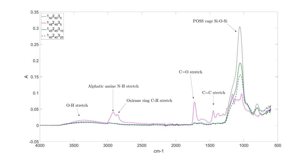
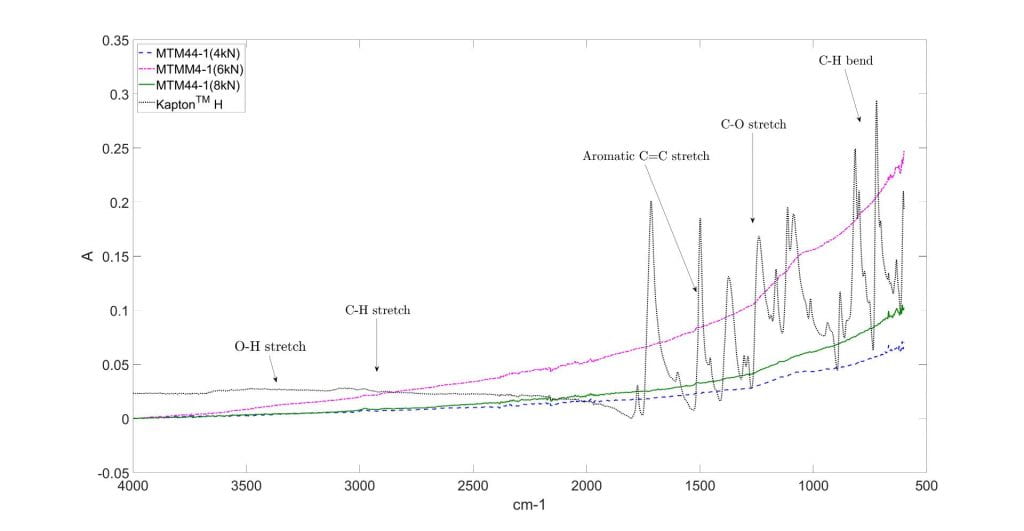
A Perkin Elmer Fourier-transform infrared (FTIR) spectrometer was used to analyse the Attenuated Total Reflectance (ATR) of the surface spectroscopy. Fifteen scans were performed per sample over a spectral range of 650–4000 cm−1. Figure 2a displays the absorption bands of the composites with POSS nanofiller. Significant peaks at the aliphatic amine N-H stretching region (2800-3000cm−1), as well as an intense band around 1100 cm−1 were observed. This is related as after AO samples exposure, the epoxy rings were opening due to the reaction with the POSS and diamine molecules, leading to the construction of hydroxyl groups. Figure 2b the laminates without nanofillers were presented, including KaptonTM H, with a significant change on the oxirane ring due to C-H stretching vibrations.

(a) Composites with POSS content
(b) Composites with MTM44-1 only

Figure 2: Infrared spectra of the cured epoxy ultra-thin composites and KaptonTM H after twelve months of AO exposure

Correlation

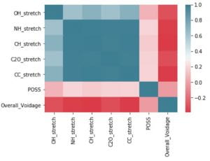
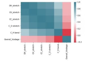
A standard correlation, following Pearson’s method applied on JupyterLab was followed based on the dataset obtained from each sample after exposing them on an interval of two months, until a total of twelve months was achieved. Figure 3 shows the relationship between each selected infrared band presented on Fig 2 and the voids content of each composite. The overall voidage for laminates with nanofillers (Fig.3a) relies more on the change of the POSS band (1100cm−1) due to coating creation. However, this value is less dependent on the C-H stretching vibrations (2850cm−1). For MTM44-1 composites (Fig.3b), C-H stretch band presented the most positive correlation with the overall voidage and the most negative is with the C-H bend region (800cm−1). It was observed that mostly all the bands were directly related to each other after each exposure.

(a) Composites with POSS content
(b) Composites with MTM44-1 only

Figure 3: Correlation between selected infrared bands and overall voidage content

Future work

For future work, the dataset size established during this project could increase, by selecting a wider range of thermosets or any other types of materials applied for space structures. This will allow the selection of the material accordingly to the structure performance require. Moreover, further tests, such as Thermogravimetric Analysis (TGA), Dynamic Scanning Analysis (DSC) and Nuclear Magnetic Resonance (NMR) could be applied to achieve a more detailed characterisation of the resins. The mechanical properties of the samples could also be analysed based on three-point bending test and tensile testing to observe the stiffness, strength and toughness properties and identify the advantages or disadvantages of the nanofiller percentages on the structures. Finally, this analysis could also be applied to different areas,such as the aeronautical, maritime and civil sectors, as well as medical engineering areas to select the best resin composite depending on the application required.

Contact details

mayra.riveralopez@bristol.ac.uk

Bristol Composites Institute (ACCIS), Advanced Composites Collaboration for Innovation and Science, Department of Aerospace Engineering, University of Bristol BS8 1TR

Jean Golding Institute Seed Corn Funding Scheme

The Jean Golding Institute run an annual seed corn funding scheme and have supported many interdisciplinary projects. Our next round of funding will be in Autumn 2020. Find out more about our Funding opportunities

Predicting cause of death and the presence of bad healthcare practice from free-text summaries

We used machine learning to predict cause of death from free text summaries of those diagnosed with prostate cancer; and the presence of bad practice in health and social care for those who have died with learning difficulties.  

Aims

Knowledge of underlying cause of death (UCoD) is a key health outcome in research and service improvement but is not always accurately recorded. Likewise, the identification of bad practice is also vital to understanding health outcomes in the population and improving health care provision 

We have applied machine learning (ML) classifiers to over 4,000 death reviews (free text summaries), from the Cancer Research UK Cluster randomised trial of PSA testing for prostate cancer (CAP) and Learning Disability Mortality Review programme (LeDeR). Each review was assigned a label either prostate cancer death or poor healthcare practice by independent experts. This expert assignment was used to train the ML techniques to: 

  1. Identify the key elements (words and phrases) that are good predictors of
  • Prostate cancer death or 
  • Poor health or social-care practice  

2. Add user confidence by explaining how the ML techniques work, rather than solely relying on the prediction probability that is output by the classifier. In this sense we add transparency to the ML.

We developed the methodology using data from the CAP project, and subsequently applied it to the LeDeR data to test how well it could generalise.  

Results

The first step was to build a tool to predict prostate cancer death from the free text summaries. Using a random forest (RF) classifier with a bag-of-words feature set we found that we could predict prostate cancer death with >90% accuracy. We then investigated how the RF was classifying the free-text summaries by looking at which elements in the free-text summarises were used by the RF to assign prostate cancer death. To do this we investigated a variety of potential visualisation techniques: 

Word clouds

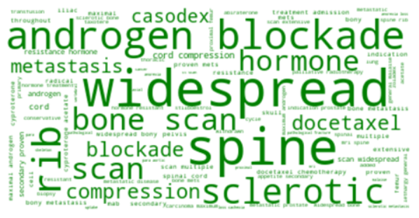
Word clouds provide a visual representation of the words (or group of words) that are most predictive of prostate cancer deaths across the dataset. The word clouds show that clinically important signs of progressing prostate cancer, are key to identifying prostate cancer deaths.  

Figure 1: A word cloud showing the most important features for classification of prostate cancer death (using a random forest). The size of the word indicates the ‘importance’ of the feature.

Interpretable text-outputs

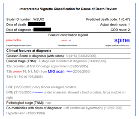
We also used both tree-interpreter and LIME to identify which words contributed most to any given classification. We then visualised these contributions by formatting the original free-text summary to indicate which text elements contribute to the classification, so that the classifier’s decision can be understood by a human reader. 

Figure 2: Snapshot of human-interpretable classifier output. Text elements in the cause of death review are formatted to show their contribution to the classification. The size of the font indicates the importance of the word or phrase and the colour illustrates whether the word indicates prostate cancer death (blue) or not (red).

Writing style

Using free-text is dependent on the quality of the text, which can influence the performance of ML techniques.  

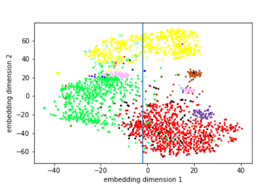
These visualisations use the t-SNE algorithm to show clear clusters of free-text summaries that contain similar elements. Here we can identify the three main clusters, where the summaries share commonalities in style, and represent three different authors, where each author is presented by a specific colour. This analysis even brought the authorship of some reviews into question (note the two separate pink clusters, which appear to be so divergent in this data representation). 

Figure 3: T-distributed stochastic neighbour embedding (t-SNE) of the feature space. Each point is a cause of death review and their proximity in the space indicates their similarity in terms of the language they contain. Colours represents authors of the review. The blue line is a boundary that separates the two distinct clusters of reviews written by the pink author.

Hard vs Easy cases

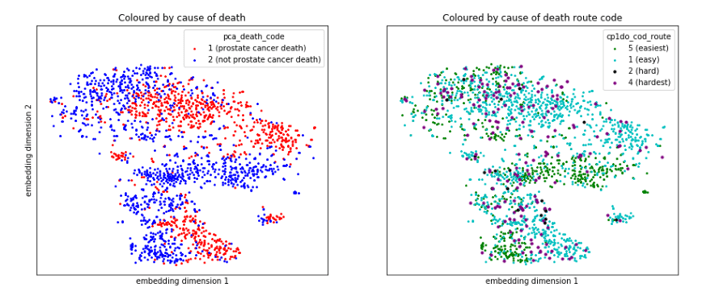
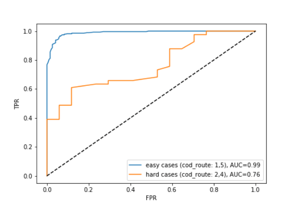
Cases where there was disagreement between the panel of experts about the cause of death are potentially the same cases where the ML classifier is less certain of the prediction. Figure 4 illustrates that the cases the expert panel found “hard” to assign cause of date (purple and black points in the right hand panel) often sit in the location where prostate cancer (red) and non-prostate cancer deaths (blue) meet in the left hand panel. This is a space where the ML techniques are less certain about when predicting cause of death. This is confirmed by figure 5, which shows that the classifier performs much worse on the ‘hard’ cases than the ‘easy’ cases. 

Figure 4: The two panels show the same embedding of the feature space with points coloured according to: cause of death (left panel) and ‘difficulty’ (right panel). Difficulty of a case is assessed by the ’cause of death route’ which provides a range of how hard the human experts found it to determine the actual cause of death.
Figure 5: Receiver operating characteristic (ROC) curves showing the classifier performance for ‘hard’ and ‘easy’ cases.

The classification of ‘hard’ cases appears to be a more difficult task and we have yet to produce a classifier with good performance for this purpose.  It could be that we need to engineer additional features from the reviews to successfully predict hard cases. Also, natural language elements, such as negation or hedging terms are notoriously difficult to detect but may improve performance at this task 

Generalising to LeDeR

Our methodology was successfully applied (see figures 6 and 7) to the LeDeR dataset, which contains more verbose reviews and a much larger number of authors. The ability of the method to generalise to this challenging dataset validates our approach and encourages us to further develop the approach for application across new domains in the future.  

Figure 6: Receiver operating characteristic (ROC) curves showing the classifier performance when trained to predict ‘poor practice’ on the LeDeR dataset. Note that this classifier is currently overfitted and additional work is required to produce a classifier that generalises better.
Figure 7: Similar to figure 1, this word cloud shows the most important features for classification of poor healthcare practice in the LeDeR dataset.

Future plans for the project

This exploratory project has identified several avenues for further development. Notably, we have developed Python code that can predict prostate cancer deaths from free-text summaries, and demonstrated its application to a second dataset (LeDeR). This documented code will be shared on GitHub to allow others to apply our methodology to their data.  

Future work will focus on developing use cases for applying this methodology. For instance, gaining understanding of the textual elements that are key to decision making could be used to: 

  1. Provide decision support for identifying prostate cancer deaths or poor healthcare practice, reducing the need for clinical experts to review free-text summaries. 
  1. Identify the important elements of the free-text summary for the authors to target the key sections of the medical history, which would speed up the data collection. 

The ability to accurately predict hard cases would help to allocate reviewer resource more efficiently and so is a strong candidate for further development. We are also keen to produce a dashboard that would allow users to interactively explore their own datasets using the methods we have developed. We are exploring external funding opportunities to continue this project and are writing up our results for publication in a special edition of Frontiers in Digital Health.   

Contact details and links

Dr Emma Turner, Population Health Sciences 

Ms Eleanor Walsh, Population Health Sciences 

Dr Raul Santos-Rodriguez, Engineering Mathematics 

Dr Chris McWilliams, Engineering Mathematics 

Dr Avon Huxor, School of Policy Studies 

Methods derived in part from: FAT-Forensics toolbox 

Jean Golding Institute Seed Corn Funding Scheme

The Jean Golding Institute run an annual seed corn funding scheme and have supported many interdisciplinary projects. Our next round of funding will be in Autumn 2020. Find out more about our Funding opportunities